Introduction
LIFT is a community-focused program developed by PLAN Okanagan to support individuals with disabilities through education, independence, wellness, and meaningful connections. For this project, I worked alongside a design team to create a welcoming and recognizable brand identity that reflects the program’s values of inclusivity, growth, and community. Our goal was to develop a cohesive visual identity that feels approachable, uplifting, and professional across both digital and print materials.
Colour
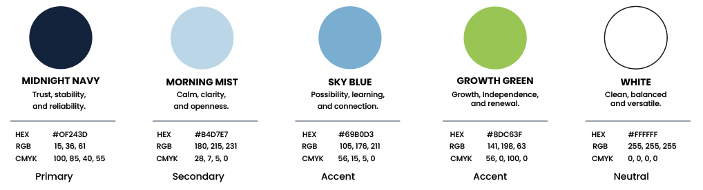
When choosing the colours for LIFT, we wanted to create a balance between professionalism and approachability. Blues were selected to communicate trust, calmness, and connection, while green was introduced to represent growth, independence, and new opportunities. Together, these colours create a positive and welcoming identity that reflects LIFT’s values.
Typography
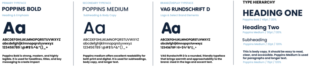
When selecting typography for LIFT, we focused on readability, accessibility, and creating a friendly, modern feel. Poppins was chosen for its clean and professional appearance, while VAG Rundschrift D adds a softer, more approachable personality to the brand. Together, these typefaces create a consistent and welcoming visual identity.
Images
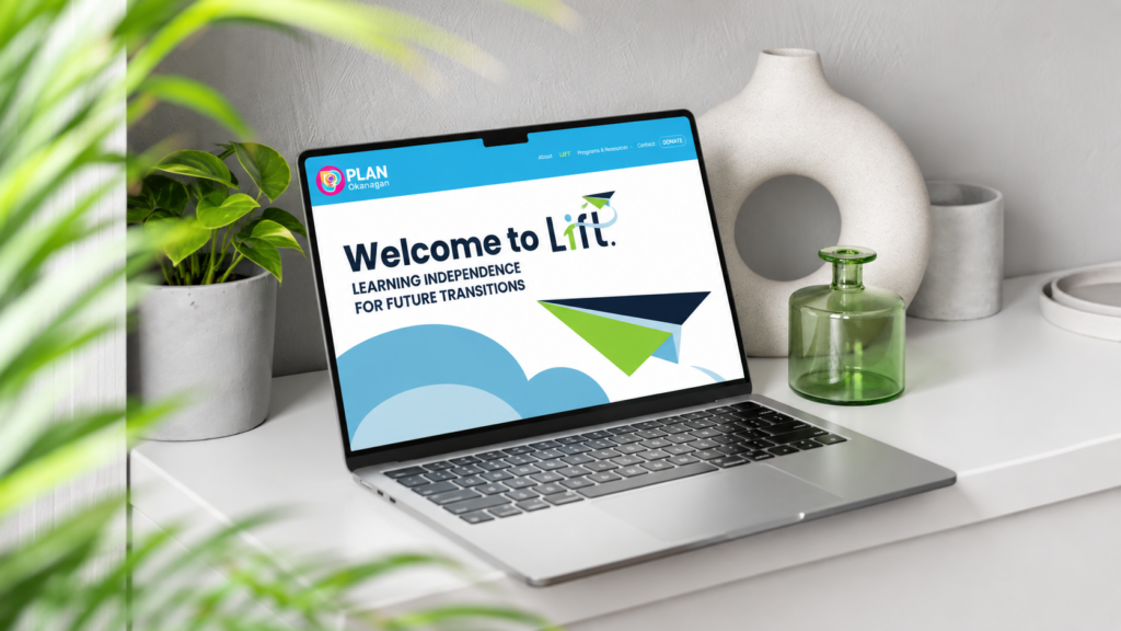

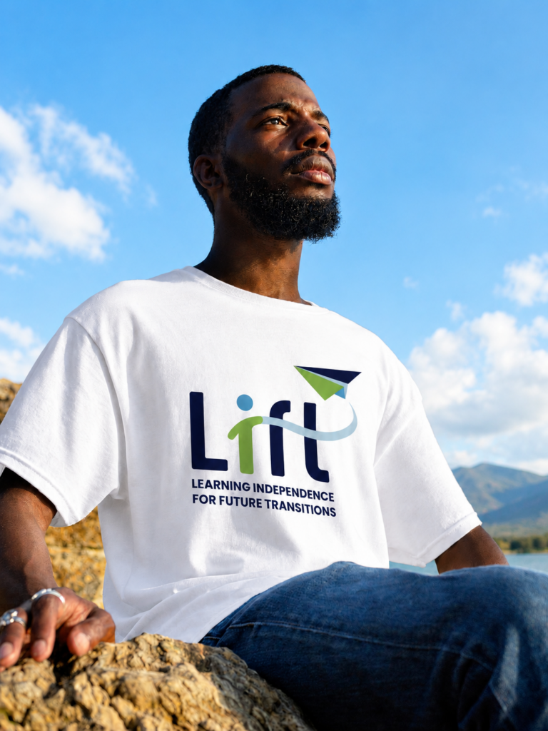
About The Images
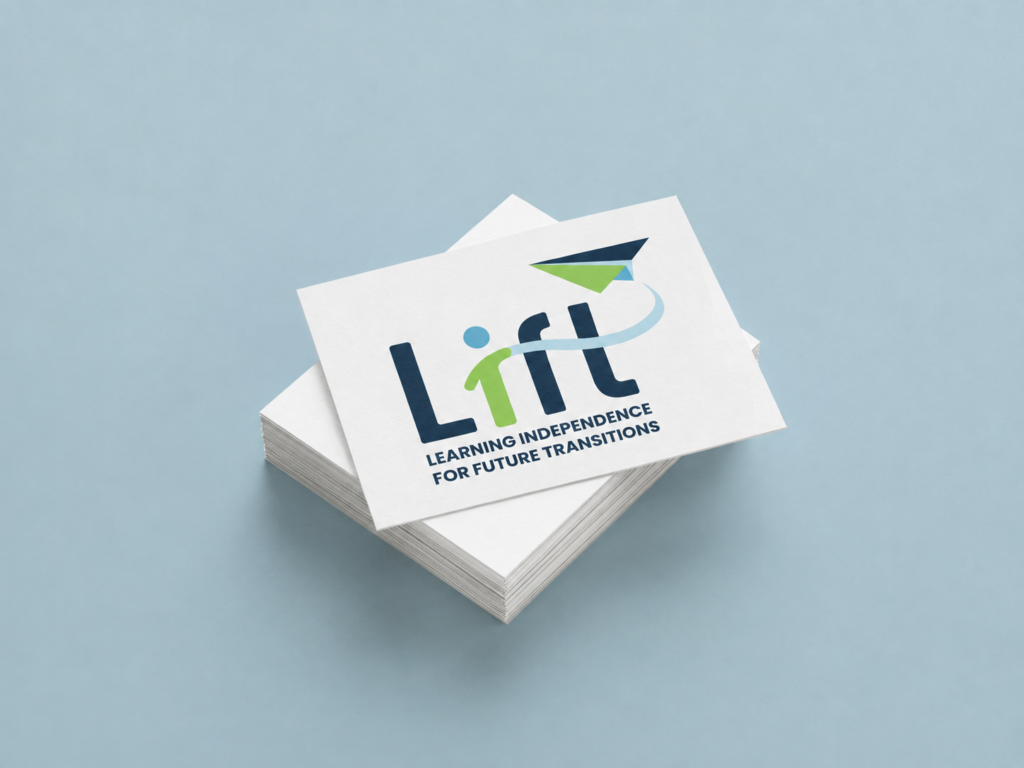
These mockups showcase how the LIFT brand identity comes to life across different applications, including business cards, apparel, and digital platforms. Each design demonstrates the versatility and consistency of the brand while maintaining its welcoming and professional feel. This project was a collaborative effort, with contributions from my classmates Zack Topolniski, Nicole Ramsey, and Kasha May, who helped bring these designs together.
Related Posts
View

Summit & Stone Ceramics

Avera

Brick 22
Making Ideas Happen.
About
Privacy
Social
Designed with WordPress